Styling Scrollbars
WebKit now supports styling of the scrollbars in overflow sections, listboxes, dropdown menus and textareas. For those who want to skip the article and just go right to the source, here is an example.
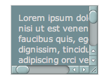
Here is a screenshot for those not running a recent enough WebKit:
The scrollbar pseudo-element indicates that an object should use a custom scrollbar. When this pseudo element is present, WebKit will turn off its built-in scrollbar rendering and just use the information provided in CSS.
::-webkit-scrollbar {
    width: 13px;
    height: 13px;
}
The width and height properties on the scrollbar element indicate the width of the vertical scrollbar and the height of the horizontal scrollbar. Percentages can be specified for these values as well, in which case the scrollbar will consume that percentage of the viewport area.
A scrollbar consists of scrollbar buttons and a track. The track itself is further subdivided into track pieces and a thumb. The track pieces represent the areas above and below the thumb.
In addition the scrollbar corner can now be styled, as well as the resizer used by resizable textareas.
Here is a complete list of all the new pseudo-elements. All of these pseudo-elements must be prefixed with -webkit-.
scrollbar
scrollbar-button
scrollbar-track
scrollbar-track-piece
scrollbar-thumb
scrollbar-corner
resize
Each of these objects can be styled with borders, shadows, background images, and so on to create completely custom scrollbars that will still honor the settings of the operating system as far as button placement and click behavior.
The following pseudo classes have been introduced and can be applied to the pseudo-elements.
:horizontal – The horizontal pseudo-class applies to any scrollbar pieces that have a horizontal orientation.
:vertical – The vertical pseudo-class applies to any scrollbar pieces that have a vertical orientation.
:decrement – The decrement pseudo-class applies to buttons and track pieces. It indicates whether or not the button or track piece will decrement the view’s position when used (e.g., up on a vertical scrollbar, left on a horizontal scrollbar).
:increment – The increment pseudo-class applies to buttons and track pieces. It indicates whether or not a button or track piece will increment the view’s position when used (e.g., down on a vertical scrollbar, right on a horizontal scrollbar).
:start – The start pseudo-class applies to buttons and track pieces. It indicates whether the object is placed before the thumb.
:end – The end pseudo-class applies to buttons and track pieces. It indicates whether the object is placed after the thumb.
:double-button – The double-button pseudo-class applies to buttons and track pieces. It is used to detect whether a button is part of a pair of buttons that are together at the same end of a scrollbar. For track pieces it indicates whether the track piece abuts a pair of buttons.
:single-button – The single-button pseudo-class applies to buttons and track pieces. It is used to detect whether a button is by itself at the end of a scrollbar. For track pieces it indicates whether the track piece abuts a singleton button.
:no-button – Applies to track pieces and indicates whether or not the track piece runs to the edge of the scrollbar, i.e., there is no button at that end of the track.
:corner-present – Applies to all scrollbar pieces and indicates whether or not a scrollbar corner is present.
:window-inactive – Applies to all scrollbar pieces and indicates whether or not the window containing the scrollbar is currently active. (In recent nightlies, this pseudo-class now applies to ::selection as well. We plan to extend it to work with any content and to propose it as a new standard pseudo-class.)
In addition the :enabled, :disabled, :hover and :active pseudo-classes also work with scrollbar pieces.
The display property can be set to none in order to hide specific pieces.
Margins are supported along the axis of the scrollbar. They can be negative (so that the track can for example be inflated to cover the buttons partially).
The linked example above provides a very complex scrollbar that has all of the OS X scrollbar behaviors (double buttons, an inactive look, track overlapping the buttons, etc.) as well as many of the Windows Vista scrollbar behaviors (hover effects, unique pressed looks above and below the track, etc.).