A guide to Scroll-driven Animations with just CSS
CSS animations have come a long way since Apple first introduced them to the web in 2007. What started as simple effects like animating from one color to another has turned into beautiful, complex images twisting and flying across the page.
But linking these animations to user behavior like scrolling has traditionally required third-party libraries and a fair bit of JavaScript, which adds some complexity to your code. But now, we can make those animations scroll-driven with nothing more than a few lines of CSS.
Scroll-driven animations have increased browser support and are available in Safari 26 beta, making it easier for you to create eye-catching effects on your page. Let me show you how.
First, let’s break down the components of a scroll-driven animation.
A scroll-driven animation has three parts:

- the target: the thing on the page that we’re animating
- the keyframes: what happens to the element when the user scrolls
- the timeline: what determines whether the animation proceeds
What’s great about these three parts is that two out of the three are probably already familiar to you.
The first, the target, can be whatever you want to move on your page, styled to your heart’s content.
The second, the keyframes, are the classic CSS animation that’s been around for years. Creating amazing scroll-driven animations largely depends on how great your animation is. If you’re new to CSS animations, check out MDN’s resource.
The third part, the timeline, might be less familiar, but it’s an important part of scroll-driven animation. Let’s explore it in more detail.
What are timelines?
Animations have a beginning, middle, and end, moving sequentially along a timeline. The default timeline on the web is called the document timeline and it’s time-based. That means that as time passes, the timeline progresses as well.
If I have an animation using the default timeline, it animates as time moves forward. If I start with a green circle and I want to animate a color change using the default timeline, then I might make it turn red in the first second, then blue a second later, then yellow on the third. The colors animate with time.
This is the way animations have worked for years. Then, the animation-timeline property was introduced as part of the CSS Animations Level 2 spec in June 2023. That allowed us to think of other things that might impact animation besides the passing of time, like a user scrolling up and down our webpage, and made scroll-driven animations possible.
With scroll-driven animations, we’re no longer using time. Instead, we have two new types of timelines to work with: scroll and view.
scroll() timeline
With scroll timelines, the animation doesn’t progress with time — it progresses based on the user’s scroll.
If the user starts scrolling, the movement begins. The moment the scroll stops, the movement stops too. It’s this new timeline that creates that link between scrolling and animation.
A common way to demonstrate how scroll-driven animations work is by creating a progress bar. In reality, since you already have scroll bars, you don’t need a progress bar like this, but it’s an easy-to-follow example, so let’s go with it.
The first thing to do is create my target, the element that we’re going to animate.
Let’s build that target as part of my website for a coding school, the A-School of Code. If we were to create a progress bar at the bottom of our page, we might add it as a pseudo-element of our footer. We want it to start at the bottom left and progress to the right.
The code might look like this:
footer::after {
  content: "";
  height: 1em;
  width: 100%;
  background: rgba(254, 178, 16, 1);
  left: 0;
  bottom: 0;
  position: fixed;
}
That’ll get us a narrow yellow bar going across my page (highlighted by the pink arrow):
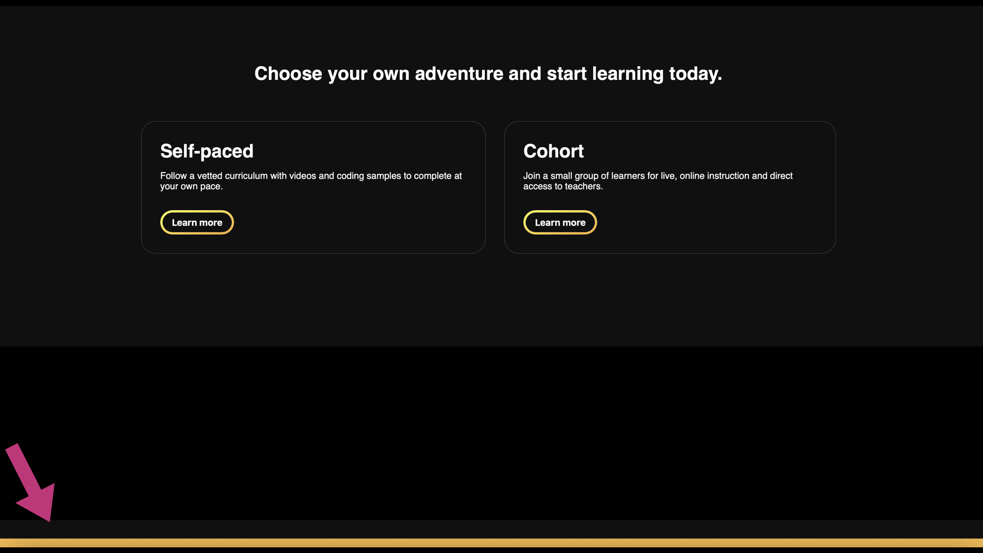
Next, we need our keyframes to create the actual animation.
We’re going to give our keyframe a custom name, let’s say “progress-expand,” like this:
@keyframes progress-expand {
  from { width: 0% }
  to { width: 100% }
}
Third, we need to use our new timeline — **** scroll(). This tells my browser that the animation should only take effect while my user is scrolling, making it a scroll-driven animation.
footer::after {
  ...
  animation-timeline: scroll();
}
And finally, we need to tie together our three components by adding our animation property to our progress bar, like this:
footer::after {
  ...
  animation: progress-expand;
  animation-timeline: scroll();
}
Note: Your animation-timeline property must be set after your animation property, otherwise, this will not work.
And just like that, you have your first scroll-driven animation.
Because we added motion to our page, there’s one thing we need to consider before we ship. Is the movement we just added going to cause any motion discomfort for our users? Is our page accessible?
The subtle, usually slow movement of a progress bar is unlikely to be a motion sensitivity trigger, partly because it’s not taking up much of the viewer’s field of vision. In comparison, larger, wider field-of-vision animations often simulate movement in three-dimensional space, using techniques like parallax, zoom, or depth-of-field like focal blur. Users with motion sensitivity are more likely to experience these larger animations as real movement in three-dimensional space, and are therefore more likely to experience other negative symptoms like discomfort or dizziness.
When in doubt, it’s a good idea to wrap your animation in a media query that checks for reduced motion preferences, like this:
@media not (prefers-reduced-motion) {
    /* animation here */
}
That way, your animation will only run if the user has not set reduced motion preferences. To learn more about when to use prefers-reduce-motion, read our article, Responsive Design for Motion (https://webkit.org/blog/7551/responsive-design-for-motion/). In this case, I think our animation is safe.
Here are our final results:
Here’s all the code in one place for easy viewing:
footer::after {
  content: "";
  height: 1em;
  width: 100%;
  background: rgba(254, 178, 16, 1);
  inset-inline-start: 0;
  bottom: 0;
  position: fixed;
  transform-origin: top left;
  animation: grow-progress linear;
  animation-timeline: scroll();
}

@keyframes grow-progress {
  from { transform: scaleX(0); }
  to { transform: scaleX(1); }
}
View() timeline
The timeline we used in the example above, the scroll() timeline, becomes active as soon as we start scrolling, with no regard as to what’s visible to the user or when it shows up in the viewport.
That might be what you want, but more often than not, you want an animation to happen when your target element appears on the page.
Your element could be anything — a carousel, a menu, a gallery of images. But whatever it is, on most websites, the element you want to animate usually isn’t permanently visible on the page. Instead, it shows up as the user explores your site, poking its head into the viewport when you scroll far enough down the page.
So rather than activating the timeline when the user starts scrolling, you want the timeline to activate when the element appears in the viewport, and for that, we need a different timeline for our animation — the view() timeline.
To see how it works, let’s look at a simple example of an image sliding into place when it enters my viewport as we scroll.
I’ll start with a basic article using placeholder text and insert a few images at different parts of the page. Since the images are further down the article, they’re not in the viewport when the page first loads.
Let’s revisit the three things I need for my scroll-driven animation:
- the target: the thing on the page that we’re animating
- the keyframes: what happens to the element when the user scrolls
- the timeline: what determines whether the animation proceeds
My targets are the images in the article, which I have in my HTML. Great! One down, two to go.
Next, I need to set my keyframes. That’s the animation part of scroll-driven animations.
I want two things to happen here — I want the image to fade in and I want it to slide in from the right. I can make that happen with the following code:
@keyframes slideIn {
  0% {
    transform: translateX(100%);
    opacity: 0;
  }
  100% {
    transform: translateX(0%);
    opacity: 1;
  }
}
And, lastly, I need to set my new animation-timeline in my image tag so that it activates when it’s in the viewport.
img {
  animation-timeline: view();
}
Now that I’ve got my three parts, I need to bring them all together by setting the animation property on my image.
Remember, it’s important to set the animation property first. Otherwise, this won’t work.
img {
  animation: slideIn;
  animation-timeline: view();
}
That gets us the nice sliding effect we’re looking for.
But there’s one more thing I want to do for this animation. You’ll notice that the picture doesn’t finish sliding into place until it’s almost out of the viewport. That means that our image is in motion the whole time it’s visible, and that’s not a great experience for our user.
What we really want is for it to slide into place and then stay there for awhile so the user can properly take it in without the distraction of all the movement. We can do that using another property called animation-range .
The animation-range tells our browser when to start and stop the animation along our timeline. The default range is 0% to 100%. The 0% represents the moment when the target element starts to enter our viewport. The 100% represents the moment when the target element completely exits our viewport.
Because we haven’t set our animation-range, we’re using the default values. That means that as soon as the first pixel of my image enters my viewport, my animation begins and it doesn’t end until the last pixel exits.
To make it easier for my users to actually see these images, I want the animation to stop when they’re about halfway through the viewport. At that point, I want the image to find its place and just stay there. To do that, I’m going to change my range to 0% and 50%, like this:
img {
  animation: slideIn;
  animation-timeline: view();
  animation-range: 0% 50%;
}
And this time, the animation stops when the image gets halfway up the page, just like I want.
Do you feel the difference of the change? Does it make it easier to view the images? Do you think a different range would be better? Asking ourselves these questions allow us to better understand what these changes mean for our users, so it’s good to take a moment to reflect.
Another thing to consider before we ship is the impact of this animation on our motion-sensitive users. Just like our previous example, since we’re introducing motion, we have to check if we’re triggering possible motion discomfort.
In this case, I have a bigger animation than my progress bar. The images on my page are pretty big, and if you’re not expecting them to move and you scroll too fast, they can zoom by. That can cause discomfort. Since I want to play it safe, I’m going to put this in a reduced motion query, so my final code will look like this:
img {
  @media not (prefers-reduced-motion) {
    animation: slideIn;
    animation-timeline: view();
    animation-range: 0% 50%;
  }
}
Now, I can ship.
Next Steps
There’s more you can do with the animation timeline and the animation range. Since scroll() and view() are functions, you can pass in certain values to truly customize how your scroll driven animation works. You can change the default scroller element. That’s the element with scroll bars where the timeline is set. If you pass nothing in, the default value for this is nearest and it’ll find the nearest ancestor with scroll bars. But you can also set it to root and self. The second value you can change is the scrollbar axis. The default there is block but you can also set it to inline, x, and y. Try the different values yourself and see how they work.
There’s more you can do around the entry and exit of your animated elements as well, to get the exact effect you’re looking for. We’ll cover those in a future post. In the meantime, play around with scroll and view timelines in Safari 26 beta and see how you can elevate the user interaction on your website or web app.
And when you do, tell us your thoughts on scroll-driven animations. Send me, Saron Yitbarek, a message on BlueSky, or reach out to our other evangelists — Jen Simmons, on Bluesky / Mastodon, and Jon Davis, on Bluesky / Mastodon. You can also follow WebKit on LinkedIn. If you find a bug or problem, please file a WebKit bug report.