Item Flow – Part 2:
next steps for Masonry
Back in March, we published Item Flow, Part 1: a new unified concept for layout, an article about a new idea for unifying flex-flow and grid-auto-flow into a single set of properties under a new item-flow shorthand. We shared some new ideas being developed in the CSS Working Group, discussed how they might fit into Flexbox and Grid, and hinted at the implications for future layouts.
Here’s a refresher of what Item Flow will entail:
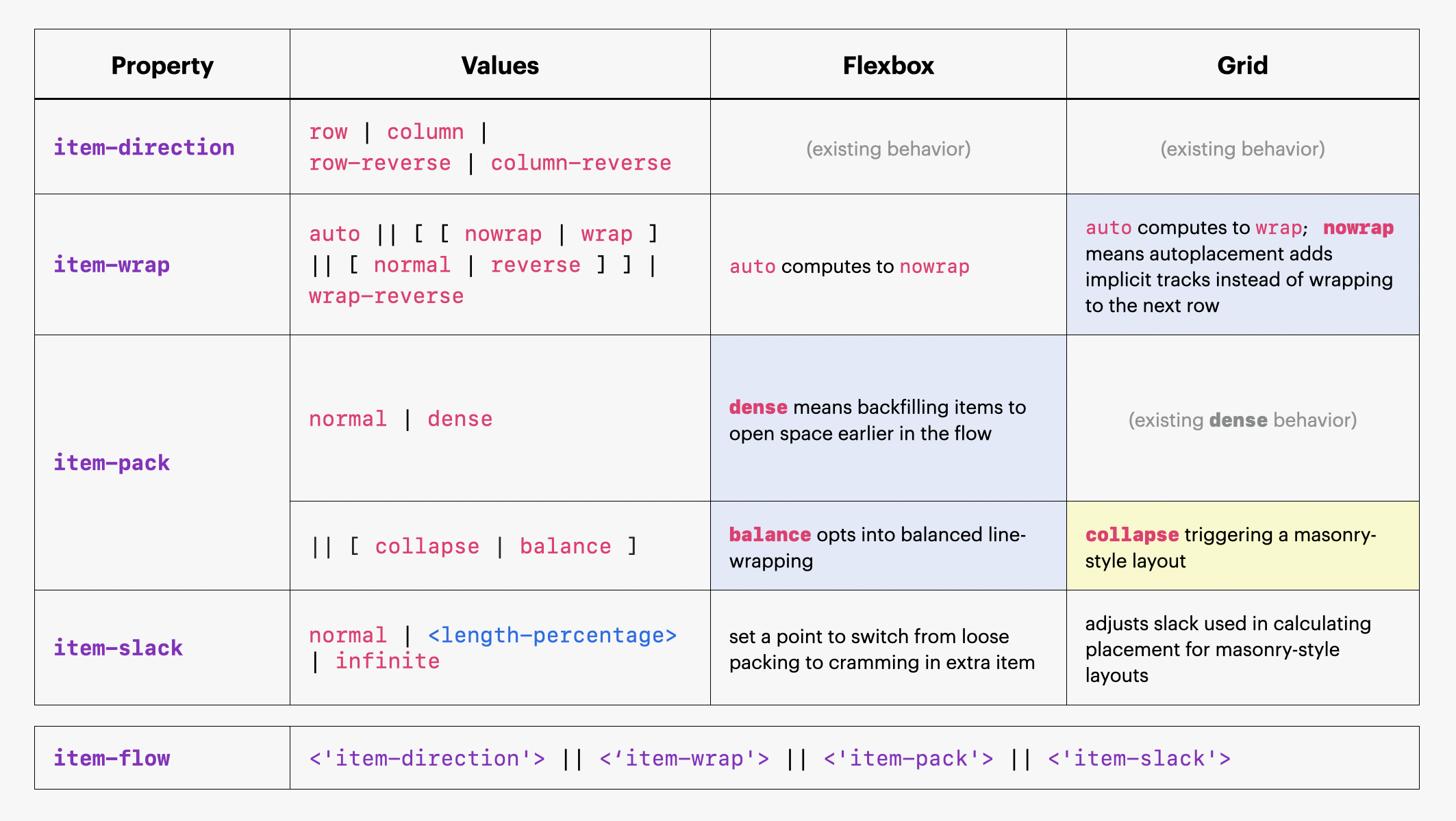
The Item Flow proposal is still being refined and has a few outstanding issues. Once adopted, it will let you replace some of the Flexbox- and Grid-specific properties with universal Item Flow properties in the future. These properties offer a new, unified syntax for existing features (though the existing syntax will work for a long time) as well as new capabilities in both Flexbox and Grid. For more info, check out Part 1 of this blog post.
In this post, we’ll unpack the big question — what does this mean for Masonry?
You might remember some of the open debate questions we blogged about earlier. Most have been resolved. At its January F2F, the CSS Working Group adopted the idea of re-using grid templating and placement properties (grid-*) for masonry-style layouts, and it adopted (in principle) the idea of using the new Item Flow properties to control how items are placed. You can see this in the current official Working Draft of the masonry layout spec.
But there are still two key open questions for Masonry and how it should integrate with Item Flow: how do you switch into a masonry-style layout, and what do row and column mean?
Let’s dig into these open questions, the debates and proposals, and your role in influencing the future of this much anticipated layout.
Integrating item-flow and masonry-style layout
Introducing Item Flow to the world of masonry-style layouts has opened up a number of questions on how it will work. In particular, there are two issues currently being debated. Let’s walk through both.
Issue #1: How do we switch into a masonry-style layout?
The first question is, how do we trigger a masonry-style layout? On the surface, this question is about syntax, and indeed there are two to pick from. But if we take a step back, it’s much more than that.
Determining how we trigger masonry-style layouts requires us to first consider a bigger question about where masonry-style layouts fit into CSS displays. Do you view this layout as its own, unique display, separate and distinct from Grid and Flexbox? Or is it similar enough to Grid to be considered a member of that ecosystem? These two mental models, two very different opinions on what a masonry-style layout even is, are reflected in the two ways to trigger this layout.
If your mental model of the masonry-style layout puts it in a world all on its own, then using a new, unique display value makes more sense. If we went with that, the code would look like this:
.container {
  display: masonry;
  grid-template-columns: repeat(auto-fill, minmax(14rem, 1fr));
  gap: 1rem;
}
But if you see masonry-style layouts as simply a variation of Grid, then using grid as the display value and the new item-flow keyword to collapse the rows would make more sense. That would look like this:
.container {
  display: grid;
  grid-template-columns: repeat(auto-fill, minmax(14rem, 1fr));
  item-flow: collapse;
  gap: 1rem;
}
We’ll discuss the pros and cons of display: masonry vs display: grid option later in this article. There’s currently an open issue about which we should use.
Issue #2: What’s a row, anyway?
When it comes to describing a layout, there are two approaches. We can think of it in terms of “flow-of-items” or by the “shape-of-layout.” While these aren’t technical terms and aren’t officially part of the CSS syntax, they’re helpful terms to use for this conversation. Both “flow-of-items” and “shape-of-layout” are valid in Flexbox and Grid, but in a masonry-style layout these two interpretations diverge.
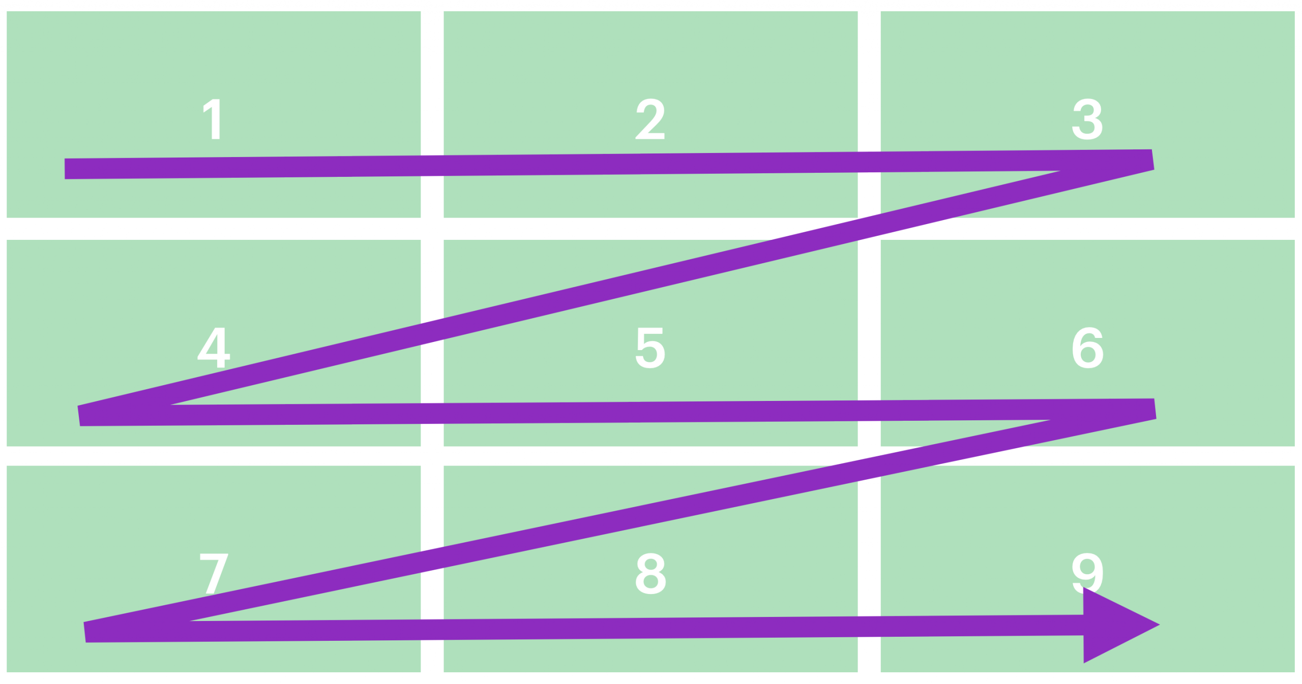
Flexbox
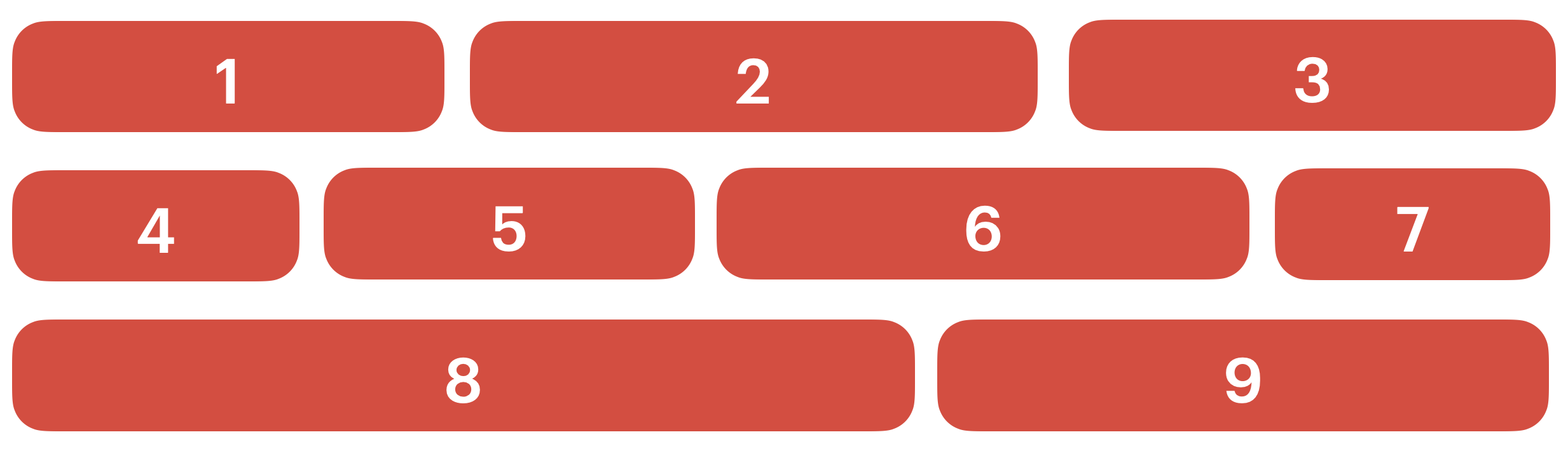
Here, we’re using Flexbox to lay out nine items across several rows and columns. But when we describe this layout, do we describe it as items organized by rows or columns?
Describing it by “flow-of-items” would have us look at how items are placed, or how they flow across the page. In this example, items are placed left to right, filling up the first row then moving down to the next one.
So we would describe the “flow-of-items” here in terms of rows.
But there’s a second way to describe it, called “shape-of-layout,” which focuses on the visual shape that this layout makes. The shape that stands out here is rows.

The columns are basically nonexistent, but we can see that our items are organized into three distinct tracks, so our “shape-of-layout” value would also be rows.
You’ll notice in our Flexbox example that the “shape-of-layout” and the “flow-of-items” are the same. Whichever way you think about it, row works to describe it. While technically, the widths of the elements could also be the same and result in columns, that’s not the typical use case. In most Flexbox examples, row would be true for both “shape-of-layout” and “flow-of-items.”
Now, what about Grid?
Grid
If we look at a simple Grid example and try to determine its “flow-of-items”, you’ll see something similar.
The items flow from left to right, filing up the first row then moving downward. Just like Flexbox, we can describe this layout’s “flow-of-items” in terms of rows.
But when we consider our “shape-of-layout” perspective, we have a problem — there isn’t a clear shape that stands out. We have three distinct rows and three distinct columns.
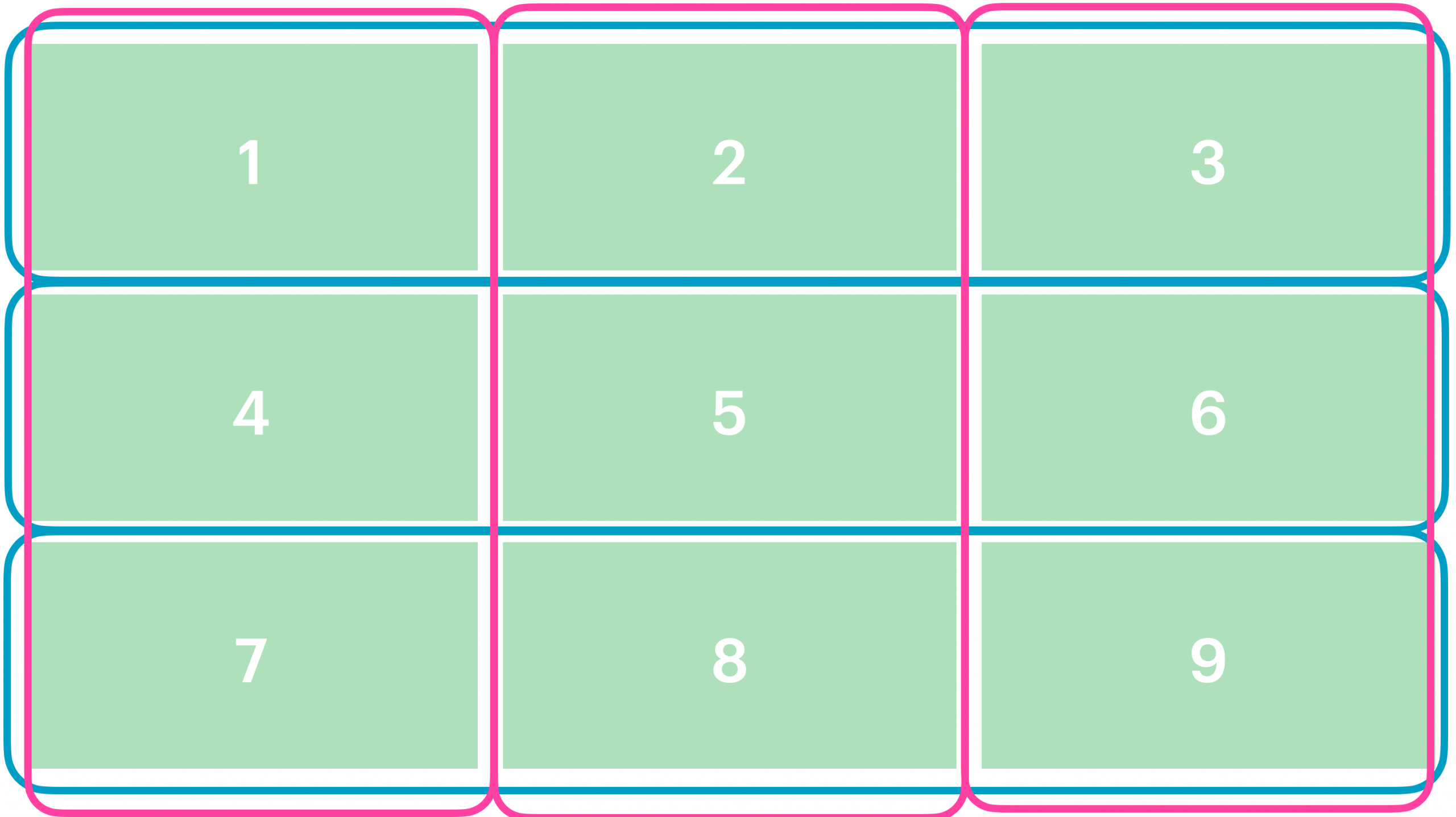
So for Grid, we can easily pick row for our “flow-of-items” value, but the resulting “shape-of-layout” depends on the width and spanning of the elements. Sometimes there’s a clear shape. Other times, there isn’t.
What about for a masonry-style layout?
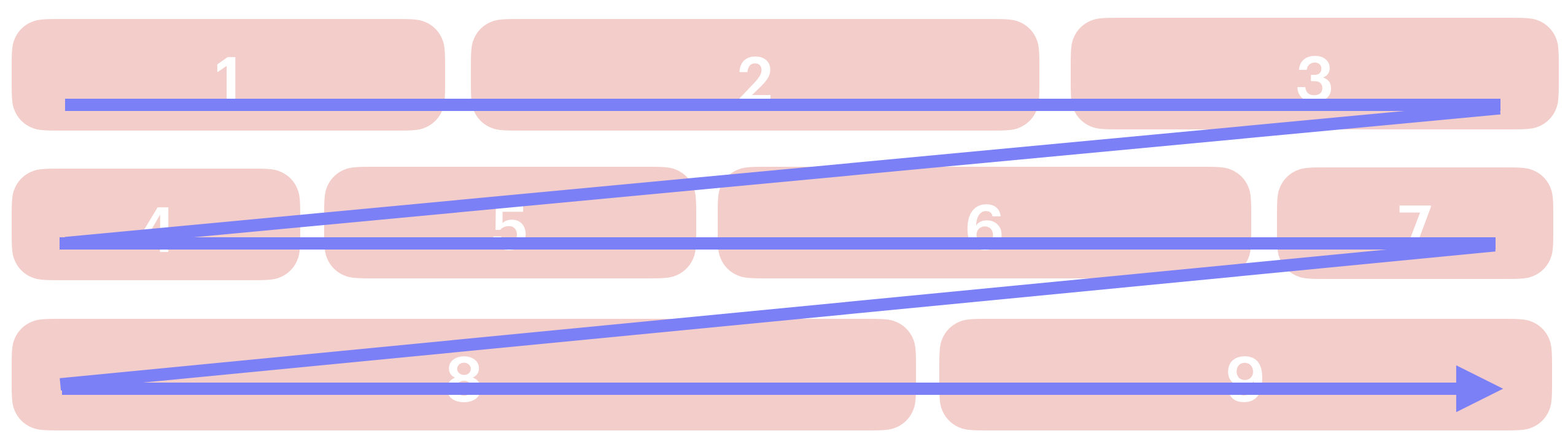
Masonry-style layout
In a masonry-style layout, these two concepts diverge. To demonstrate, let’s start by looking at a masonry-style layout example in terms of “shape-of-layout.”

Masonry-style layouts have a very particular, recognizable shape made of strict columns and messy rows. In this example, we see how, while the rows are inconsistent and broken up, we have four distinct columns.
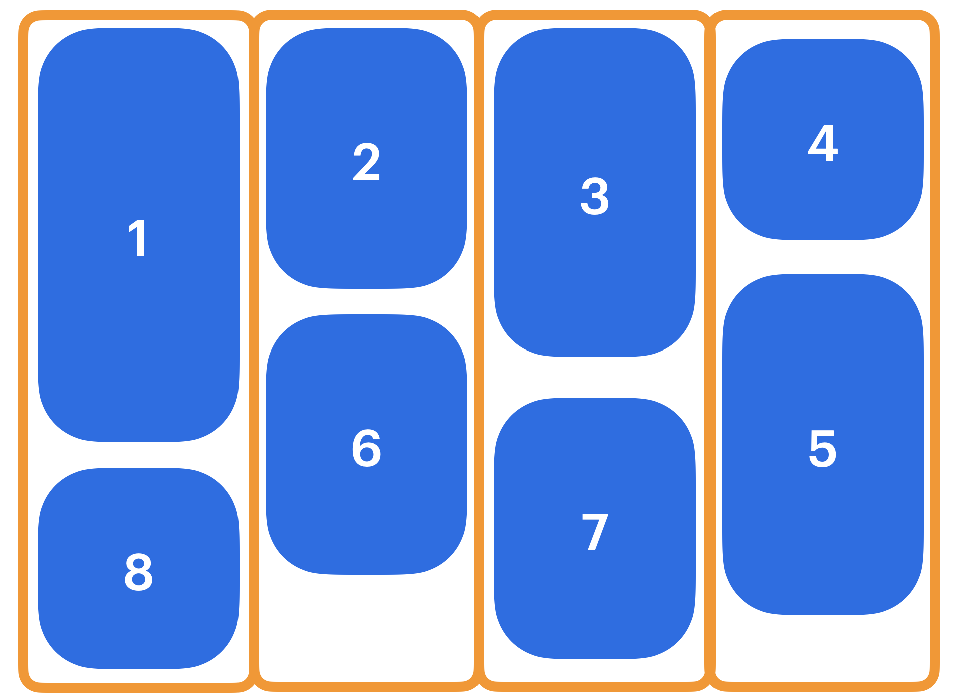
So for “shape-of-layout,” we would describe this example in terms of columns.
For “flow-of-items,” we see that we start placing our items from left to right, and only when our first row fills up do we go down to the next, top, most available row.
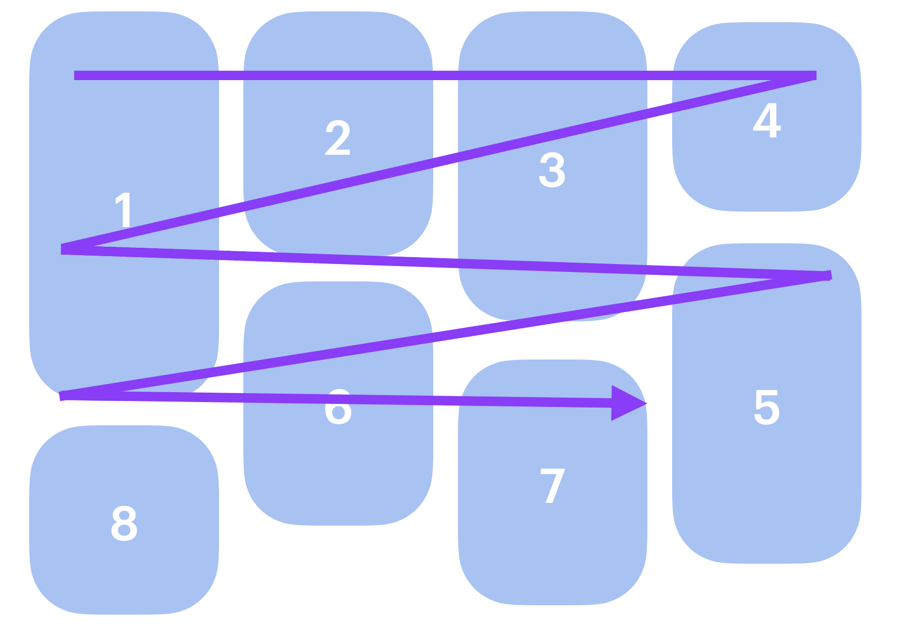
In contrast to our first Flexbox example, the values for “shape-of-layout” and “flow-of-items” are not the same. When it comes to the masonry-style layout, there is a clear distinction between the two.
In fact, the relationship between “shape-of-layout” and “flow-of-items” is actually core to how masonry-style layouts work and what makes them so special. This layout collapses its rows in the direction that’s perpendicular to the flow of content — that’s what makes it so unique. While it’s the “shape of layout” that catches the eye, it’s actually the perpendicular relationship between layout and content flow that creates the “waterfall effect” that defines it. The elements flow in one direction and the shape they make as a result is in the other direction. If, instead, you want this layout shape to be in the same direction as flow, you’d use Multicolumn instead.
So which should we use? Which is the better description to tell the browser what to do? And what do we name the item-flow sub-property that accepts this keyword?
In Flexbox, we use flex-direction to choose between row and column layouts—so would we use item-direction here? The name item-direction sounds like it’s describing the “flow-of-items” since it’s the direction of item placement. In this case, item-direction: row would indicate a waterfall-style masonry layout, like the one above. If we want a “shape-of-layout” interpretation, then maybe a different name like item-track: column would be better, since it indicates the orientation of the tracks.
But what are your thoughts?
Putting it all together: Masonry-style layouts with Item Flow
We at WebKit see masonry-style layout as a type of Grid layout, so we favor re-using display: grid and using item-direction: row | column with the “flow-of-items” interpretation. To give you a better idea of how it would work, let’s walk through an example using Item Flow to implement the masonry-style layout.
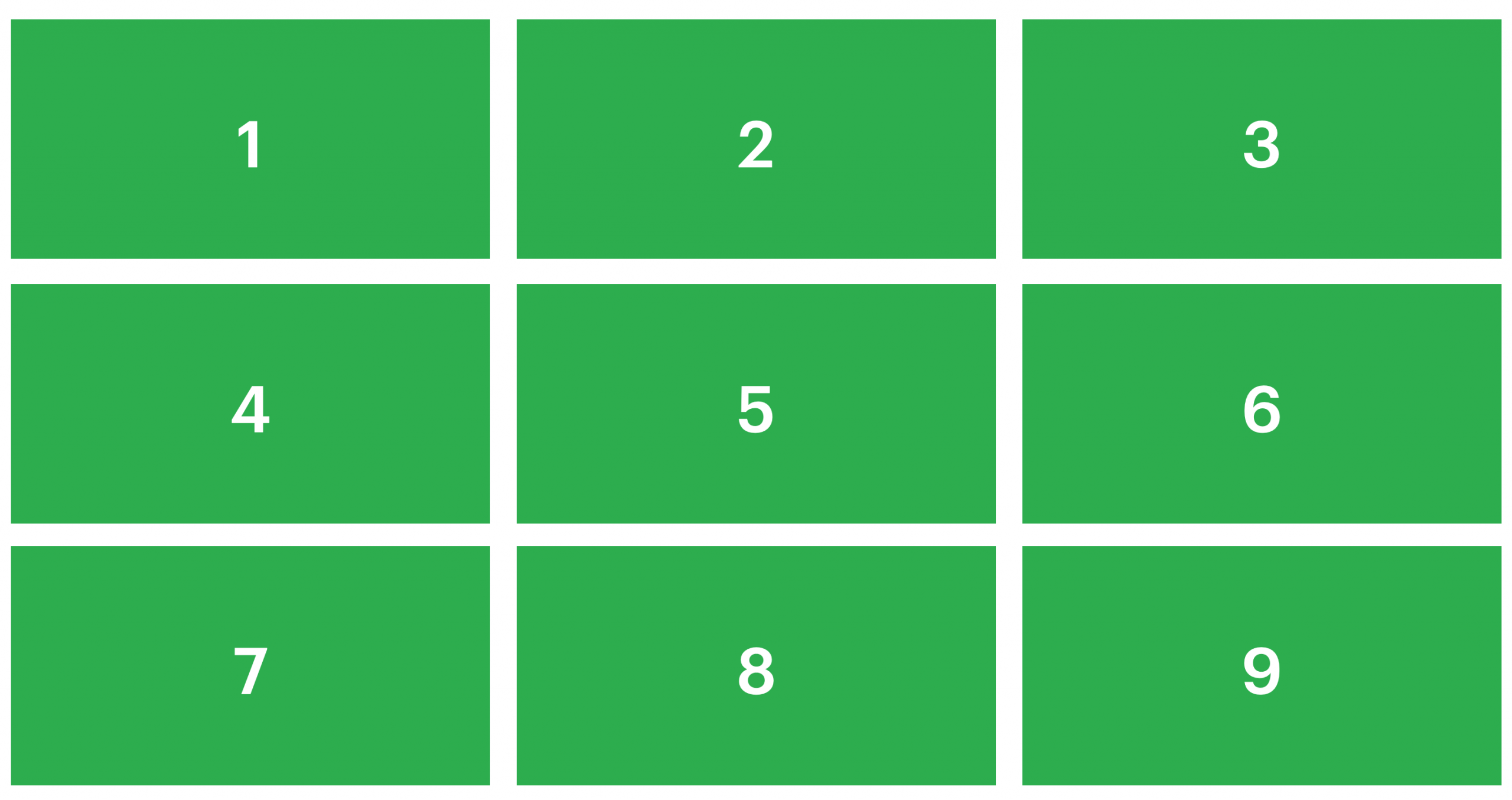
Let’s say you want to create this classic masonry / waterfall layout:

Using Item Flow, here’s the code you would write to implement it:
.container {
  display: grid;
  grid-template-columns: repeat(auto-fill, minmax(14rem, 1fr));
  item-flow: row collapse;
  gap: 1rem;
}
With this proposal, you use display: grid, and you define the size and number of columns using any of the many techniques for track definition allowed by CSS Grid. The only difference is the addition of item-flow to collapse the row axis.
By default in CSS Grid, content flows across the page in the inline direction, in this case, rows — the same direction as grid-auto-flow: row. That’s the whole point of using the masonry-style layout instead of Multicolumn, to get content to flow across the page, instead of down. Let’s number the items to make the masonry-layout pattern more obvious:
Most of the code is familiar if you know CSS Grid, and that’s intentional. We want you to have to learn as little as possible to implement this layout. All it takes to trigger a masonry-style layout is item-pack: collapse. And the direction in which the content flows is set with item-direction: row or column , just like in Grid. You could write the syntax using longhands:
item-direction: row;  /* default, so unneccesary to state */
item-pack: collapse;
Or you can combine the two together using the shorthand to say:
item-flow: row collapse;
Or even:
item-flow: collapse;
You don’t need the word “row”, but it can help to make it obvious what’s happening. You are collapsing the rows, as you pack the items into the masonry-style layout. And if you wanted to create a masonry-style layout going the other direction, you can collapse the columns instead, like this:
.container {
  display: grid;
  grid-template-rows: repeat(auto-fill, minmax(8lh, 1fr));
  item-flow: column collapse;
  gap: 1rem;
}
This solution fits what we believe to be the correct mental model. The masonry-style layout isn’t a distinct, unique layout that necessitates its own display value. It’s a variant of Grid and they have at lot in common. It makes sense to us to treat it as such. It also better fits with our existing vocabulary, like flex-direction, creating a more unified system that works consistently for all three display types, which would also make it easier to learn.
We believe this solution is not only simpler for developers to implement, but is also the most intuitive. If we look at the end user’s point of view, describing the masonry-style layout in terms of columns might feel the most obvious. Visually, it’s the columns that stand out. But they only stand out after we’ve finished laying out all the items. When the developer is creating the layout and turning a list of items into the masonry-style shape, they have to decide where to put each element and how the elements flow. “Where should each element go?” is a question all developers have to answer, and we believe that answering that question with a matching property will feel more intuitive from the developer’s point of view.
That’s our take and we believe it would be the simplest to use, teach, and understand. But it’s all up for debate, which makes it all the more important to hear from web developers and gather more input. So if you have an opinion on how this should work, particularly on the different options for the masonry-style layout switch and what you prefer in terms of row/column control syntax, we’d love to hear from you. Find Jen Simmons on Bluesky or Mastodon or Saron Yitbarek on Bluesky to share your feedback.