The Focus-Indicated Pseudo-class :focus-visible
The “focus indicator”, as its name suggests, visually indicates (often with a kind of an outline) that an element has focus. That sounds simple enough, and it perfectly describes what the old :focus selector makes possible. However, for decades now, whether a browser will actually display a focus indicator natively has been a considerably more complex affair.
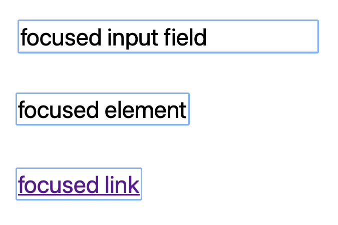
Based on lots of feedback and study, browsers have long employed heuristics about both the type of element, and how it came to gain focus, in order to determine whether the focus indicator should be displayed. If the user is navigating the page with the keyboard, it should. In other situations, it depends. A text input, for example, will display an indicator regardless of how it received focus. This is important because all users need to know where their input data will be placed. Interfaces that do not employ those heuristics feel unnatural.
The goal of the old :focus selector was to allow authors to better style the focus indicator to be in tune with their overall design choices. The trouble is that using it meant losing the heuristics. The net result, unfortunately, has been that the most common use of the :focus selector has been to remove indicators altogether. This avoids the “false positive” focus styles that cause complaints from many users. The problem is that removing focus styling breaks website accessibility, causing trouble for people navigating the page using the keyboard.
Fortunately, a new CSS selector comes to the rescue, avoiding this kind of accessibility issue while providing the behavior web developers were looking for. The :focus-visible pseudo-class matches elements based on the browsers heuristics. It allows web authors to style the focus indicator only if it would be drawn natively.
Despite being a new feature that has recently landed on the web platform, it’s already being used by almost 1% of web pages (according to the Web Almanac by HTTP Archive).
Implementation
As of Safari Technology Preview 138, the :focus-visible selector has been added to WebKit, paying special attention to interoperability with other implementations. As part of the WebKit implementation, the Web Platform Tests test suite has been improved and expanded quite a lot, adding coverage to new cases and ensuring a better interop between the different implementations.
This work led to changes and improvements all around. Thanks to tests and discussions, all browsers now follow a common set of heuristics and have the same behavior in most situations. In WebKit, for example, clicking on a <div tabindex="0"> will no longer show a focus indicator by default (matching other browser engines).
In addition, the default User Agent style sheet in all browsers now uses the :focus-visible pseudo-class. This is a nice thing to have because it avoids the type of issues that happened with :focus in the first place, and circumvents the need of using some weird workarounds, like :focus:not(:focus-visible), to style the default focus indicator painted by the browser.
If you’re curious about the implementation details, you can read a series of blog posts written along the path to development at blogs.igalia.com/mrego, or watch this talk.
Examples
The good news after all the changes that have happened around :focus-visible lately, is that now you’d just need to use :focus-visible selector to style the focus indicator drawn by the browser engines.
On top of that, browsers are no longer showing a focus indicator when the user isn’t expecting it, like focusing a regular element via mouse click.
Web authors won’t need any kind of workaround to achieve the goal of styling the focus indicator shown by the web engine.
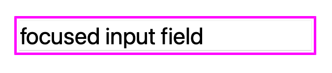
For example, if you want your focus indicator to have a thick magenta outline with a small offset, you just need to use the following CSS on your website:
:focus-visible {
    outline: solid thick magenta;
    outline-offset: 0.1em;
}
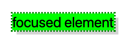
And you can use other properties, not only the outline related ones, to customize the focus indicator in your website. E.g.:
:focus-visible {
    outline: dotted thick green;
    background: lime;
    box-shadow: 0.3em 0.3em lightgrey;
}
Open Prioritization
It’s worth mentioning that this work was collectively chosen from among many, in numerous engines and partially funded by the public, through Igalia’s Open Prioritization campaign. This effort works to democratize the development of web platform features, giving groups of people and smaller organizations the chance to have a direct impact on the web ecosystem. If you want to learn more about this, Eric Meyer gave a talk explaining it at the W3C’s TPAC.
Thanks to many contributions, this experiment yielded not only :focus-visible development in WebKit, but a lot of interoperability work and alignment in other implementations and a sense that there was real demand for the feature. Thank you to everyone involved.
Feedback
:focus-visible pseudo-class has been enabled by default in Safari Technology Preview 138, please try it out and report any issues you might found on bugs.webkit.org. You can also send a tweet to @regocas or @webkit to share your thoughts about this feature.