Advanced Layout Made Easy with CSS Regions
Co-written by Beth Dakin and Mihnea-Vlad Ovidenie
CSS Regions is an exciting technology that makes it easier than ever to create rich, magazine-like layouts within web content. Regions have been under development in WebKit for a while now, and we’re delighted to tell you that they are available for use in Safari on iOS 7, Safari 7 on Mavericks, and Safari 6.1 on Mountain Lion.
Magazine-like Layout
So I wrote this little article for my personal blog:
That’s cool and all, but wouldn’t it be so much cooler if it had a more interesting layout like this?
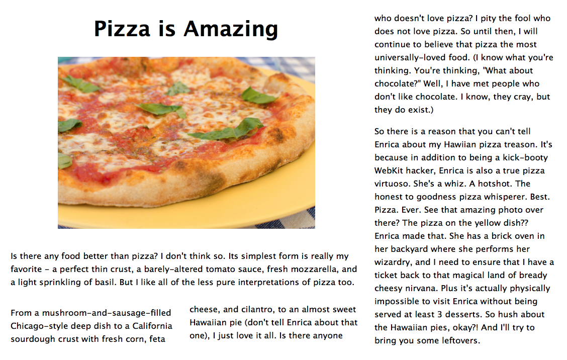
So fab! Without regions, achieving a layout like this is a pain. You have to figure out exactly which parts of the article can fit into each box and then hard-code the article content into the appropriate boxes. And after all that work, the design will get totally messed up if the user changes the font size! The layout looks cool, but doing it this way is a lot of work, and it isn’t even a little bit flexible.
Regions make achieving this layout as easy as pie. They allow authors to indicate that some sections of content are intended to define an overall layout template for a portion of the document and that other sections of markup represent the content that is intended to fill that template. The semantically-related content that will flow through the template is called a “named flow.” In our example above, the named flow is the text of my article. Once it has been named, the named flow is distributed into disjointed containers called regions, which can be positioned in any way to achieve the desired layout.
Our simple example only scratches the surface of what you can do with regions. We’ll get to more sophisticated applications later, but first let’s take a closer look at the code.
What is a Named Flow?
A named flow is a collection of HTML elements extracted from the document’s normal flow and displayed separately. Any HTML element can be part of a named flow. When an element is collected in a named flow, all of its children are collected with it.
You identify a collection of HTML elements as a named flow by using the CSS property -webkit-flow-into. In our example, the named flow will be the elements that contain the text of our article:
<style>
    #flow-content { -webkit-flow-into: pizza-manifesto; }
</style>
<div id="flow-content"><h1>Pizza is amazing</h1>…</div>
Our example only has one, but a document can have any number of named flows, each with its own name.
Flowing Into Regions
A region is a block-level element that displays content from a named flow instead of its own content. Regions can have any size and can be positioned anywhere in the document. They are not required to be siblings or to be positioned next to each other in the layout.
A region consumes content from a single named flow. Most of the time, to achieve an interesting layout, there will be more than one region associated with a named flow, and when that is the case those regions form a region chain. When content from a named flow does not fit into a region, the content simply flows into the next region in the chain.
Making an element a region is as easy as adding the -webkit-flow-from CSS property. In our example, the regions are the elements that form the layout template for the document’s overall design:
<style>
.region { -webkit-flow-from: pizza-manifesto; }
</style>
<div class="region" id="region-1"></div>
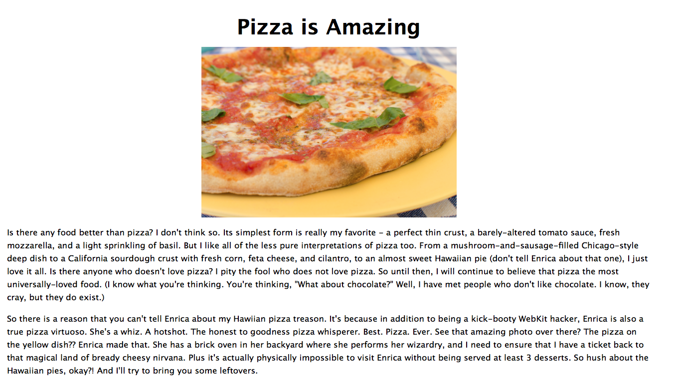
<img src="pizza.jpg" width="512" height="342">
<div class="region" id="region-2"></div>
<div class="region" id="region-3"></div>
<div class="region" id="region-4"></div>
<div class="region" id="region-5"></div>
Take a look at the code for the actual document to see the code for the regions side-by-side with the code for the named flow.
One key thing to remember about regions is that they are only visual containers. Region elements do not become the DOM parents of the elements flowed inside them; they only establish the bounding boxes that visually constrain the flow content.
Advanced Regions Features
One cool feature in the CSS Regions specification is region styling. With region styling, a designer can style the content based on which region it ends up flowing through. For example, if you wanted to change the color of the text displayed in the second region of the article flow, you could do so with region styling:
@-webkit-region #region-2 {
    p { color: green; }
}
The extra styles are dynamically applied behind the scenes whenever the layout of the article content in the regions changes. So for example, if the user resizes the browser window and different pieces of content end up flowing through the styled region, the content will update dynamically. At this time, you can only style regions with the CSS properties color and background-color, but we intend to progressively add support for more properties, so stay tuned! In the meantime, check out this version of our article that uses region styling.
There is also a whole object model available for interacting with regions and named flows from within JavaScript. The proposed API will make it even easier to create fluid designs that adapt to layout changes. For example, authors can use the API to determine whether or not there are enough regions to display the content from the named flow. Handy stuff!
Dreaming with Regions
CSS regions are powerful, and when they are combined with other advanced CSS features like shapes, filters, flexible boxes, transforms, and media queries, incredibly sophisticated designs can emerge.
Back in February, during a CSS regions pattern rodeo hosted by CodePen, Tyler Fry and Joshua Hibbert created some awesome regions demos. Tyler won the contest with his reading carousel made out of regions and transforms, and Joshua created an exploding book, featuring a nice hover effect when opening the book.
The Adobe WebPlatform team has created some very compelling demos with regions in partnership with National Geographic. Check out this article that seamlessly integrates text and photographs to create a flexible design. Adobe has also created a demo that is so cutting edge you will need to download a WebKit Nightly to view it properly. This beautiful prototype uses regions, so the article content breaks up automatically across the different containers, and if font size or window size changes, or if the user zooms in, everything reflows automatically. Check out the source code here!
We are so excited about regions as a technology and excited that they are already available for use in shipping browsers. We plan to continue to refine our implementation in WebKit and to add additional features, so be sure to check back for improvements.