Web Inspector ReferenceElements Tab
The Elements Tab is the primary source of information for anything related to the DOM of the inspected page.

DOM Tree
The Main Content Area shows a live visualization of the DOM of the inspected page, matching HTML behavior and semantics (e.g. collapsing whitespace).
Hovering over any DOM node will highlight it in the Page Overlay.
DOM nodes can be reordered by dragging, support double-clicking to edit any tag/attribute/text/etc., and (once editing) allow for tabbing to switch between editable content.
If a DOM node is not actually rendered in the inspected page, it will be displayed in greyscale. This can be disabled in the Elements pane of the Settings Tab.
Any DOM node with especially important states will have small badges after the opening tag:
- grid badges indicate that the DOM node has a CSS grid layout. Clicking it will toggle the CSS grid overlay for that DOM node in Page Overlay.
- flex badges indicate that the DOM node has a CSS flex layout. Clicking it will toggle the CSS flex overlay for that DOM node in Page Overlay.
- Event badges indicate that the DOM node has at least one DOM event listener. Clicking it will show a popover listing all event listeners for that DOM node, just like in the Node panel.
- Scroll badges indicate that the DOM node is scrollable.
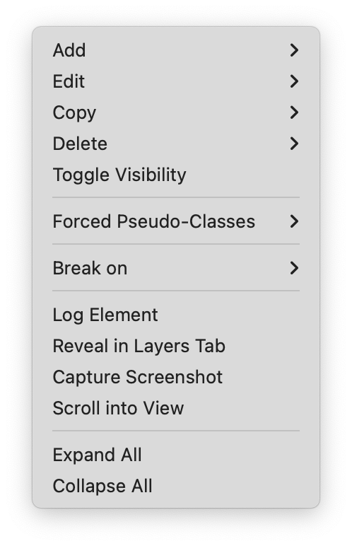
Right-clicking on any DOM node in the DOM Tree (including those not in the Elements Tab) will show a context menu with a variety of useful actions, such as Log Element (saves the DOM node to a variable in the Console), adding/removing DOM Breakpoints, toggling CSS pseudo-classes, Add/Edit/Copy/Delete commands, and more.
The top-left of the Main Content Area shows a breadcrumb navigation from the main document element to the selected DOM node, allowing for quick selection of relative DOM nodes.
There are also some toggles in the top-right of the Main Content Area:
- Badges allows for choosing which of the above badges are shown next to DOM nodes in the DOM Tree.
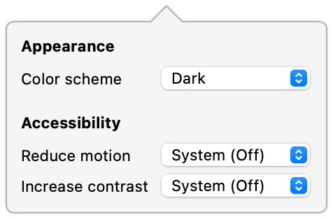
@media printCSS to apply.
Details Sidebar
-
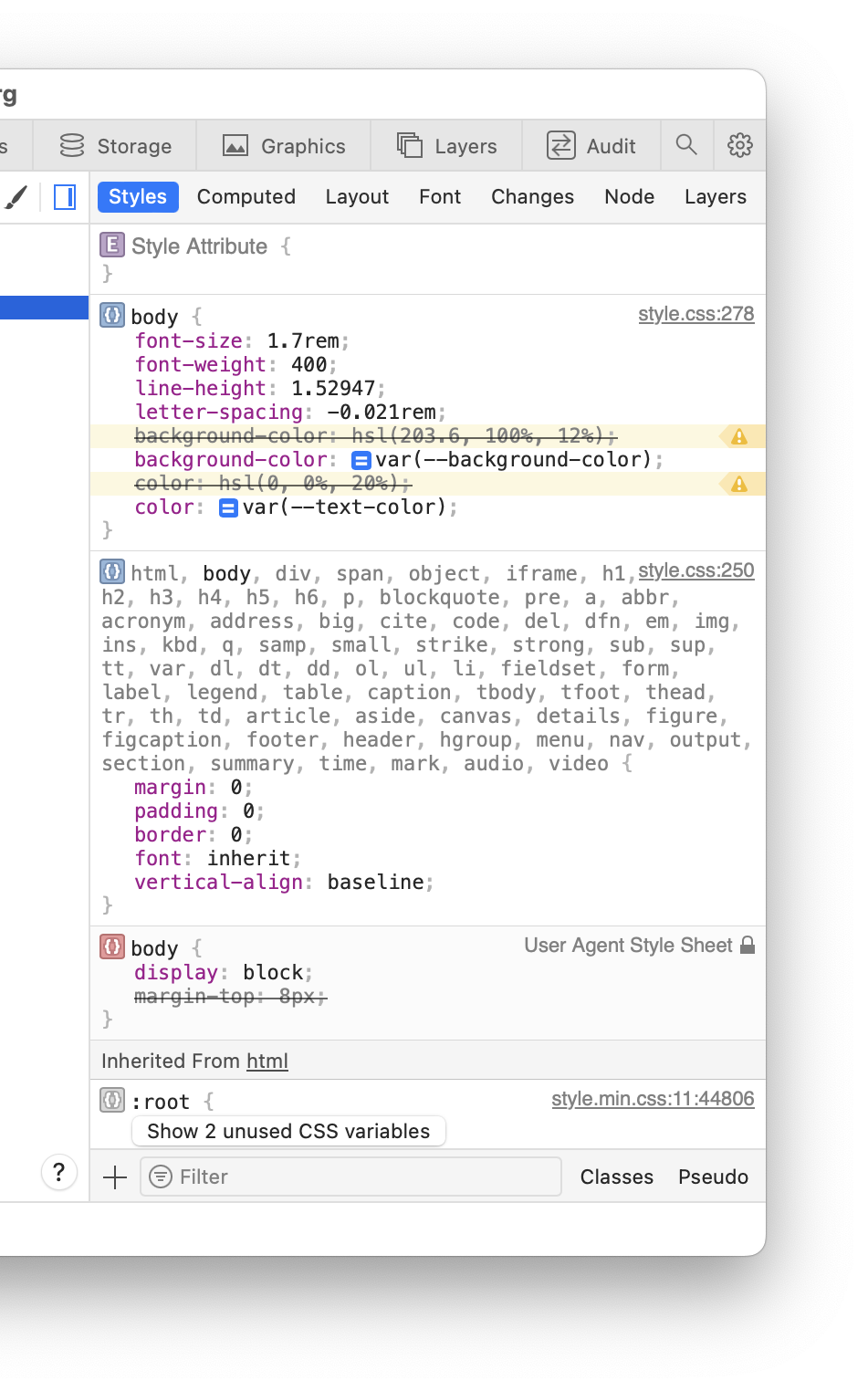
The Styles panel organizes the CSS applied to the selected DOM node in the DOM Tree by CSS selector specificity and DOM node inheritance.
By default, the Styles panel is split out into a separate column if Web Inspector is wide enough to allow more information to be visible at the same time. This is enabled by the Show independent Styles sidebar checkbox in the Elements pane of the Settings Tab.
Unless otherwise indicated, every part of each CSS ruleset is editable, including the condition text for
@media,@supports,@containerand similar CSS at-rules. Invalid declarations are indicated with a yellow highlight and have a tooltip briefly explaining why. Autocompletion is provided for CSS properties and relevant keyword/function values. Specialized editors for various CSS declaration values can be shown by clicking on the nearby image (e.g. color/gradient swatches,CSS Custom Properties, also known as CSS variables, that are declared or inherited but are not used anywhere in the matching styles are hidden by default. To reveal them, click the button to show unused CSS variables.
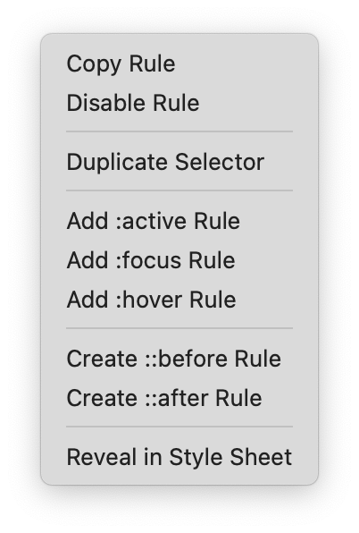
CSS selectors will gray out any part of the selector that doesn’t match the selected DOM node in the DOM Tree (or ancestor in the case of inherited CSS rulesets). Clicking on the icon next to the CSS selector will show a context menu with a variety of useful actions.
styleAttribute CSS Declaration BlockstyleAttribute CSS Declaration Block
New CSS rulesets can be created by clicking the
The Classes button in the bottom right controls a shelf that lists all CSS classes of the selected DOM node in the DOM Tree, providing checkboxes to quickly toggle each and an input to add new CSS classes.
-
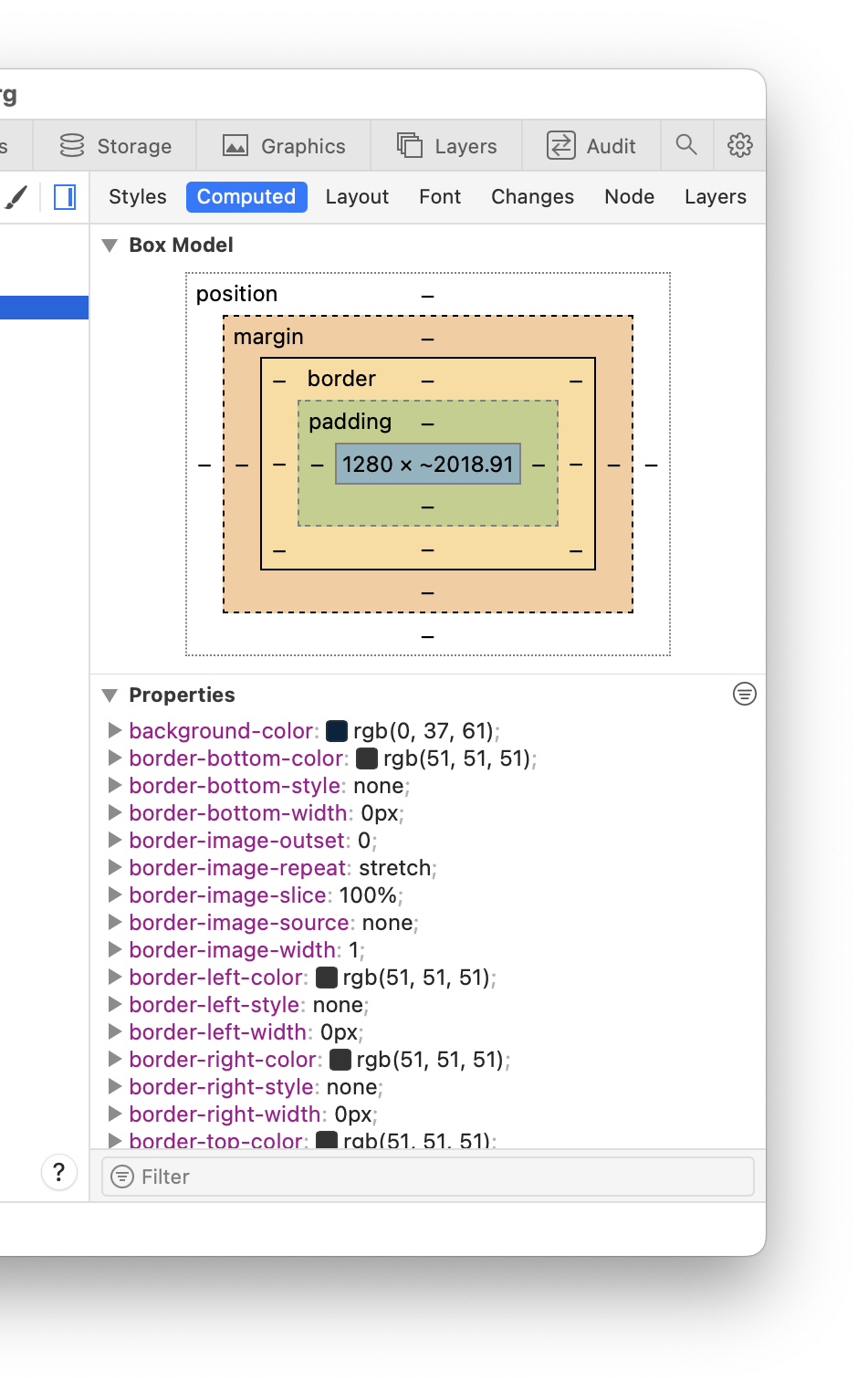
The Computed panel visualizes the CSS box model and lists the computed value for every CSS property for the selected DOM node in the DOM Tree.
By default the Properties section will only show CSS properties that have been modified by a CSS ruleset that applies to the selected DOM node in the DOM Tree. This can be changed by clicking on the
CSS variables are split out into a separate Variables section to avoid cluttering the Properties section. You can view them ungrouped, all in one section, or grouped into separate sections by value type: colors, dimensions, numbers, and others.
-
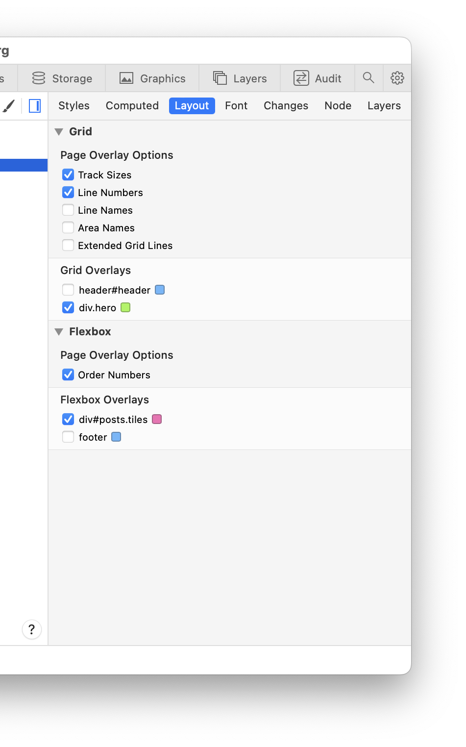
The Layout panel lists the nodes that act as CSS Grid and Flexbox containers on the inspected page and provides controls to toggle the specialized page overlay for each node, such as the CSS Grid overlay.
To change the color of each page overlay, use the color swatch next to the corresponding node listed in the Layout panel.
The CSS Grid page overlay can be configured with a set of options:
- Track Sizes: shows a label with the user-authored value for the track size or auto if the value is not explicitly set. This helps visual inspection by matching the user-authored value set in CSS with the corresponding grid track on the page.
- Line Numbers: shows a label with the ordinal and the reverse ordinal of explicit grid lines. The reverse ordinal is useful when referencing lines backward from the end. For example, 1 -4 means “the first and the fourth last”.
- Line Names: shows a label with the user-defined name for a grid line or the implicit grid line name derived from a grid area name.
- Area Names: shows a label with the user-defined name for a group of cells.
- Extended Grid Lines: extends grid lines infinitely in their respective directions.
The Flexbox page overlay can be configured so that flex items show the order number corresponding to the implicit order in the DOM or the explicit order set with the
orderCSS property value.Click the
[Options] icon in the Grid or Flexbox section headers to toggle at once all the specialized page overlays of that type. -
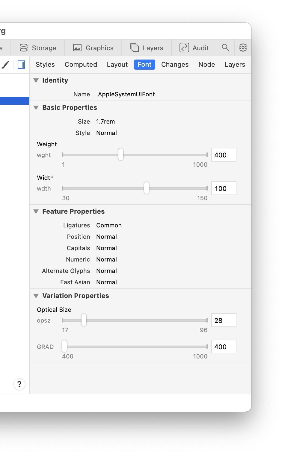
The Font panel shows information about the primary font for the selected DOM node in the DOM Tree, providing computed values for both basic properties (e.g. size, style, weight, etc.) and advanced properties (e.g. ligatures, alternate glyphs, variations, etc.).
When the primary font on the selected DOM node is a variable font, the Font panel shows editing controls for its variation axes. For each axis, it shows the axis tag (a 4 character identifier), an optional axis label, a slider control with the range of supported values, and an input field with the current axis value. While the input field is focused, hold the Arrow Up or Arrow Down keys on the keyboard to increment or decrement the value in precise steps. Hold the Shift or Option key to change the magnitude of the step.
Using the controls to change a variation axis writes the value to a corresponding CSS property on the inline styles of the selected DOM node so you can see the results live on the inspected page.
- The Changes panel lists modified CSS declarations for either the selected DOM node in the DOM Tree or for all styles in the inspected page based on the Show only for selected node setting checkbox in the Elements pane of the Settings Tab.
-
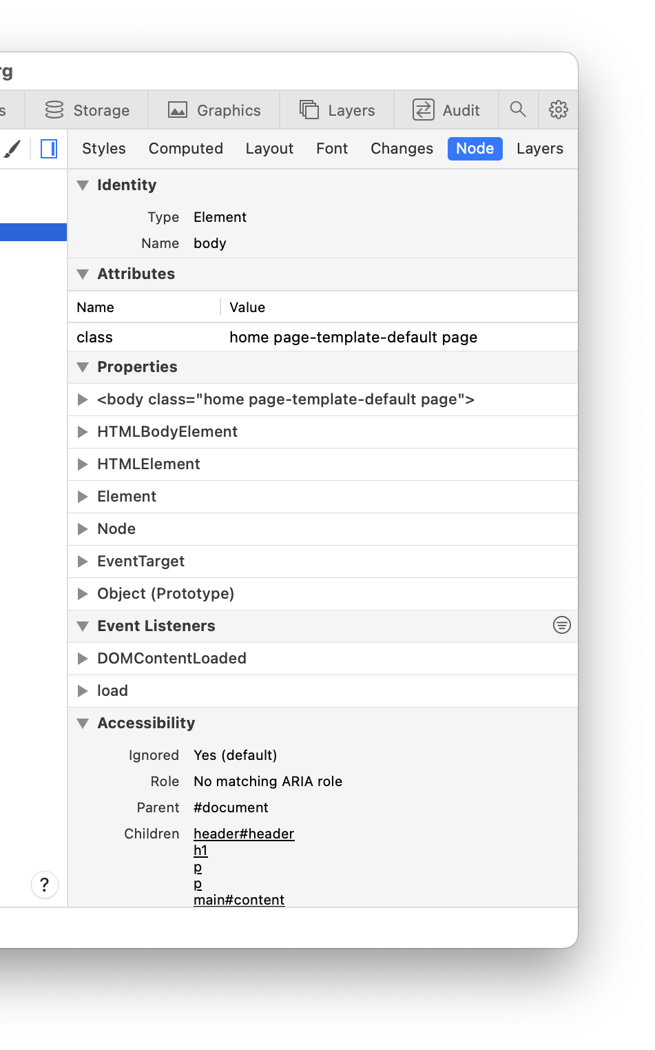
The Node panel contains more verbose representations of the attributes, accessibility data, JavaScript event listeners (including ancestors), and JavaScript object inheritance for the selected DOM node in the DOM Tree.
- The Layers panel is similar to the All Layers panel in the Layers Tab in that it shows basic information about each layer, but instead limits its scope to the selected DOM node and its descendants in the DOM Tree.









 Updated for